When it comes to utility savings, is the juice worth the squeezing?
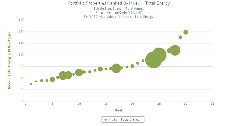
At POAH we have invested in the collection and organization of utility data for our property portfolio. Analysis of this utility bill data informs our understanding of the relative performance of the portfolio properties. This data helps point to the least efficient properties but is only the first step in the prioritization process. The next step requires an evaluation of utility use and spending within the context of property operations. How much money does the property spend on utilities? In the chart below, each POAH property is represented by a green circle. The circle to the far left represents the most efficient property, as measured in kBTU per square foot per year, and the properties get less efficient as we move to the right. The size of the circle represent annual energy spending—the bigger the circle, the more that property spends on energy. When evaluating where to focus our conservation efforts we consider both relative efficiency and annual spending. As shown, the least efficient property (farthest right) has a relatively small circle while a number of relatively more efficient properties have large circles. We target our conservation efforts on the basis of both dimensions and ask a critical question: do the potential energy savings justify the investment of time, money, and other resources necessary to capture those savings? Within every organization, the capacity for managing utility conservation projects is limited. This approach helps us target where we might best utilize that capacity.


